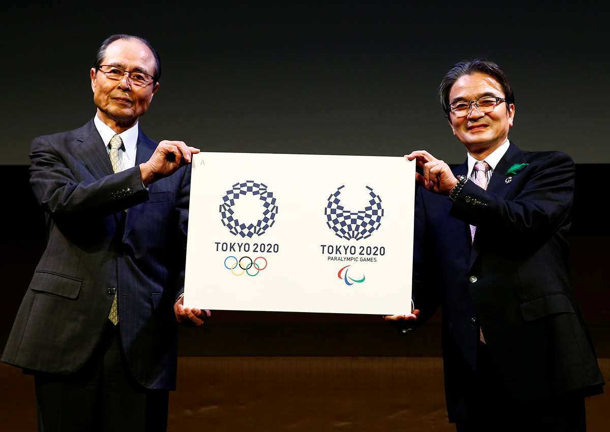
Tokyo – Tokyo 2020 Olympic organisers on Monday announced a new logo nearly eight months after the original choice was scrapped over a plagiarism scandal, but faced immediate criticism that it was ‘dull’.
The new design, chosen from a short list of four finalists unveiled earlier this month, features a circular indigo-coloured Japanese traditional checkered pattern.
“Composed of three varieties of rectangular shapes, the design represents different countries, cultures and ways of thinking,” organisers said in a release.
“It incorporates the message of ‘Unity in Diversity’.” Below the design by Tokyo-based designer Asao Tokolo are the words “Tokyo 2020” and under them the five interlocking Olympic rings.
Ryohei Miyata, head of the Tokyo 2020 emblem committee, and retired Japanese baseball legend Sadaharu Oh unveiled the winner at a Tokyo news conference.
“From this very moment, this emblem is the face of Tokyo 2020,” Murata said.
“I hope you love this emblem and support it until the 2020 games.”
Social media reaction, however, was underwhelming..
“What a dull emblem,” tweeted one user.
“They picked the least colourful one,” said another. “It’s safe but too somber.” And even those who liked it could only muster grudging support.
“This has a Japanese look so I guess it’s a good choice,” read another tweet.
The shortlisted designs were checked against registered trademarks in co-operation with the International Olympic Committee, organisers have said.
The design for the Paralympic Games was also revealed and represents a slight variation of that for the Olympics and was created by the same person.
Below the design are the words “Tokyo 2020 Paralympic Games” above the Paralympic emblem.
In September 2015, Tokyo organisers were forced to ditch a logo by Japanese designer Kenjiro Sano following allegations it too closely resembled that of a theatre in the Belgian city of Liege created by designer Olivier Debie.
Officials insisted their decision had not been in response to a lawsuit filed by Debie but slumping public confidence as Tokyo organisers lurched from one crisis to another. Sano has denied any plagiarism.
The logo controversy came shortly after Japanese Prime Minister Shinzo Abe pulled the plug on plans for a US$2 billion (S$2.7 billion) Olympic stadium amid public anger over spiralling costs.
In the face of mounting criticism, organisers opened the selection process to the public – rather than limiting it to a small group of professional designers – in a bid to improve transparency.
The Tokyo organisers unveiled the short list of four logos, after nearly 14,600 suggestions were submitted, including over a thousand by Japanese schoolchildren.
The three other finalist designs featured, respectively, a morning glory floral design, an image of an athlete crossing a finish line, and a multi-coloured ring symbolising harmony, according to the organisers.


