SINGAPORE: The architect whose redesigned MRT map earned plaudits and went viral has praised the version released by the Land Transport Authority (LTA).
Mr Cliff Tan, who published his map on Facebook in April – attracting thousands of reactions and shares – said the LTA version is “good” but has room for improvement.
“I feel the design is good, much clearer than before,” the 31-year-old told CNA on Wednesday (Dec 11).
“One thing I don’t like about the new map is the shape of Singapore island.”
While Mr Tan’s map featured a pretty accurate outline of Singapore, LTA’s version was a bit more distorted.
“It’s important to have that sense of familiarity when it comes to maps,” he said, highlighting that he spent almost as much time designing the island’s shape as the MRT lines themselves.
READ: New MRT map launched with Circle Line as focal point
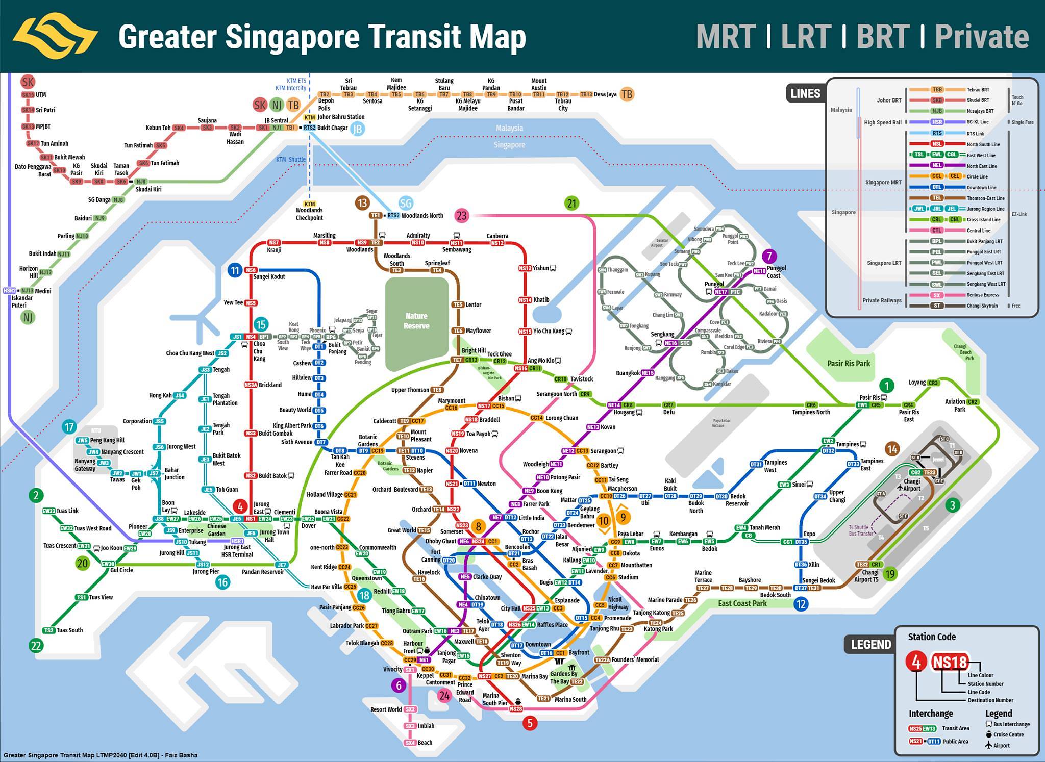
In a Facebook post on Wednesday, LTA thanked Mr Tan and 17-year-old Faiz Basha – who also uploaded his latest design on Facebook in August – for their feedback during the design process.
“We first began to redesign the map in 2015 and we’ve since taken in feedback from map designers, Friends of Land Transport and members of public,” the authority said.

Faiz Basha’s design. (Photo: Facebook/Faiz Basha)
LTA contacted Mr Tan after he published his map and they discussed several design pointers. Both parties had a chance to explain their positions, especially as private designers might not have known of LTA’s operational constraints.
“On the day that we met, LTA showed me their original design, explained the various specialists they got in touch with,” Mr Tan said, stating that he gave them feedback.
For instance, he said LTA had originally used corporate logos of Marina Bay Sands, Gardens by the Bay and the Esplanade to embellish its map.
“I told them not to do this but create their own symbols, and this they seemed to have implemented,” he added, noting that he advised them to also include the Singapore River.
LTA “DIDN’T COPY” DESIGNS
After LTA released its version on Wednesday, a few netizens questioned if LTA had stolen Mr Tan’s design.
Mr Tan rejected this, pointing out that LTA’s map was still largely different from his and Faiz’s.
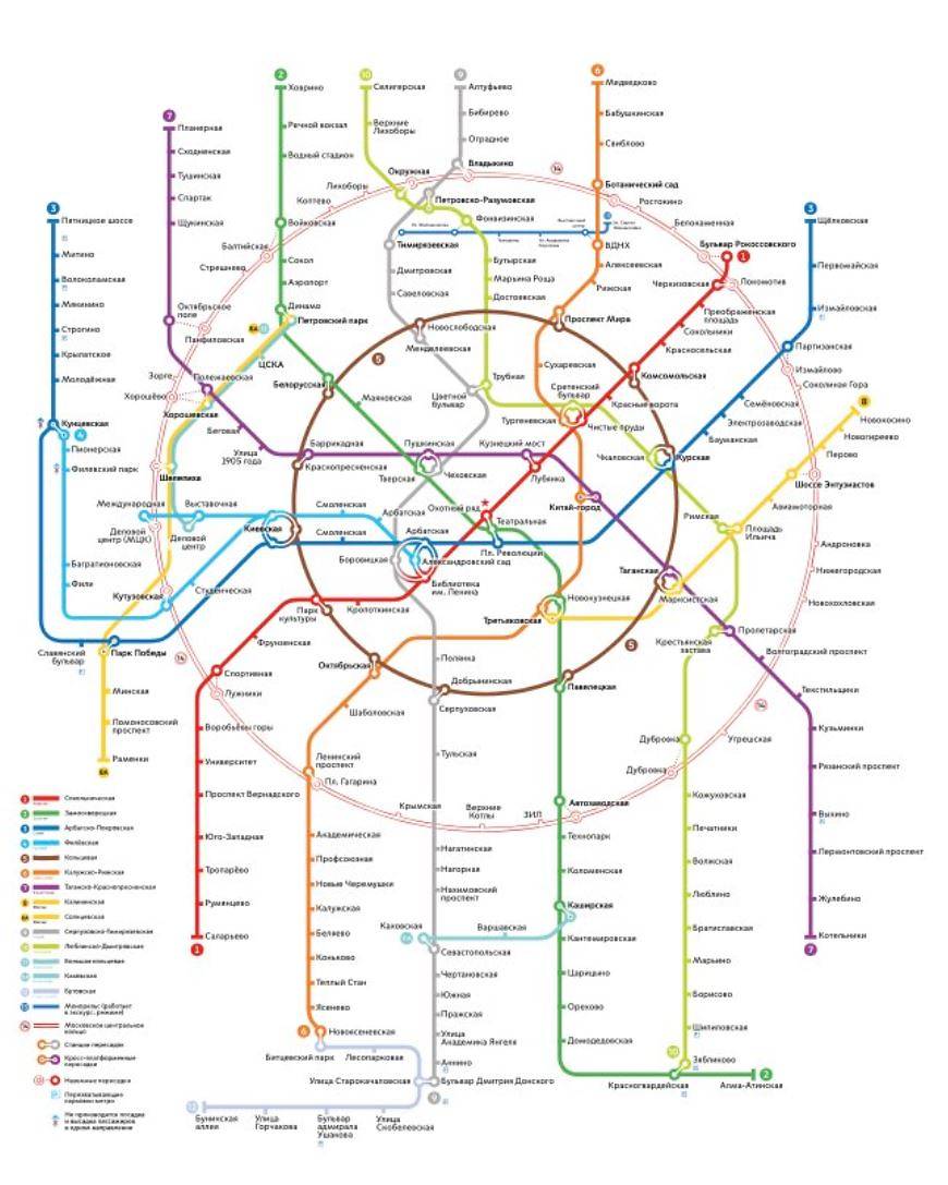
“I would say they didn’t copy from either of us, because the only similar thing is the circle, which is similar to Moscow’s (map) anyway,” he said.

Moscow’s metro map. (Source: russiau.com)
Faiz, who had also met LTA officials working on the map, agreed, stating that they take their work “very seriously”.
“Though some aspect of my or Cliff Tan’s map may have been manifested into their design, (the new map) was heavily developed by LTA,” he said in an email interview with Berita Mediacorp on Wednesday.
“I’d like to emphasise how due credit must be given to the hardworking architects and designers at LTA who have dedicated years of research and design into making the new map.”

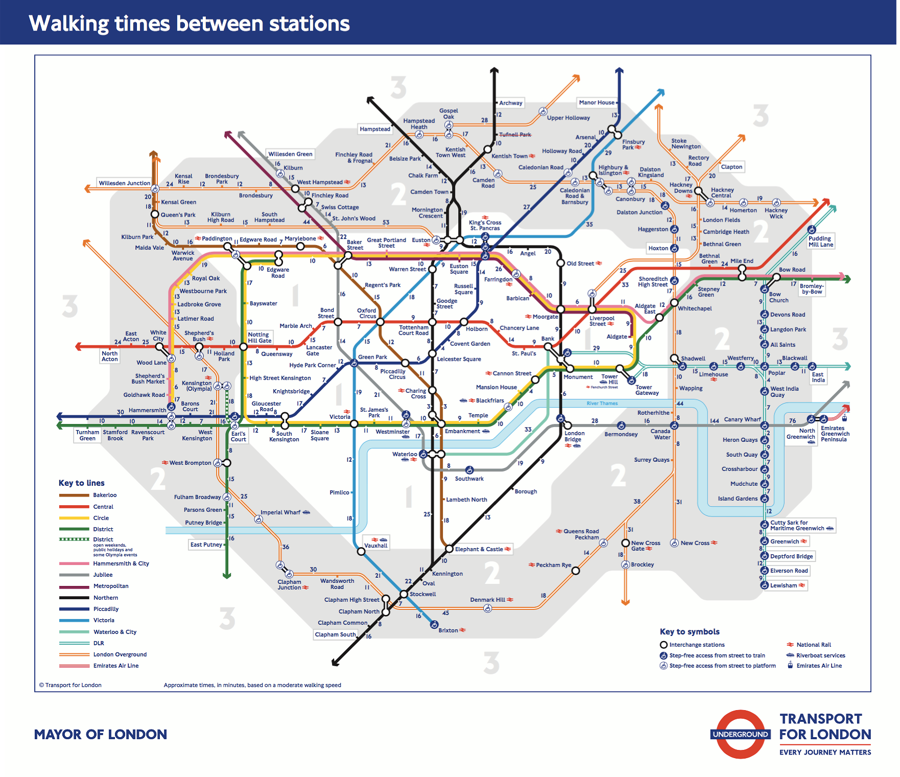
London’s tube map. (Photo: Facebook/London Underground)
After the MRT network started expanding, Faiz said he set out to create a redesigned MRT map that “would last and could become iconic”, although he only planned to use his design as his desktop background.
“A metro map is the identity of a city; it’s how people visualise and simplify the complicated reality of it,” he added, offering London’s classic Tube map as an example.
For Mr Tan, the pleasure comes from knowing that “something as banal as an MRT map can be an aesthetic yet functional piece of art”.
“Never did I do this for recognition or praise,” he said, adding that he still prefers his design to LTA’s.
“I am very happy with my design, and nothing can take that pleasure away.”


